TT&C Monitor #
The images depicted on this page use the color palette and fonts from Astro 4. All new projects should use Astro 7 colors and fonts to be considered an Astro application. Refer to this section for general user experience guidance only, not visual design guidance.
Launch TT&C Monitor Sample App | Design Materials and Source Code
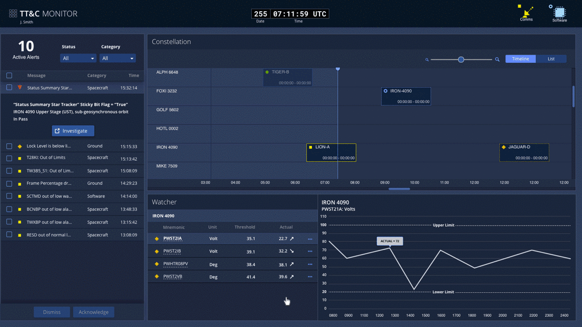
For operators of a TT&C service, maintaining situational awareness is of critical importance, and the TT&C Monitor App is designed to support this requirement. During the UX research effort, operators expressed a desire for a quick and efficient way to view overall status of their constellation and all of their systems, something lacking in their current systems. To deliver on this, the design team worked with domain experts and the operators to identify the most important data and then display it in a clear, logical manner in the app.
As operators’ primary TT&C App, the Monitor App would constantly occupy one of their large displays. The main usage would be in between contacts, when operators would use it to keep an eye on system and constellation health, prepare for upcoming contacts, and view system trends.
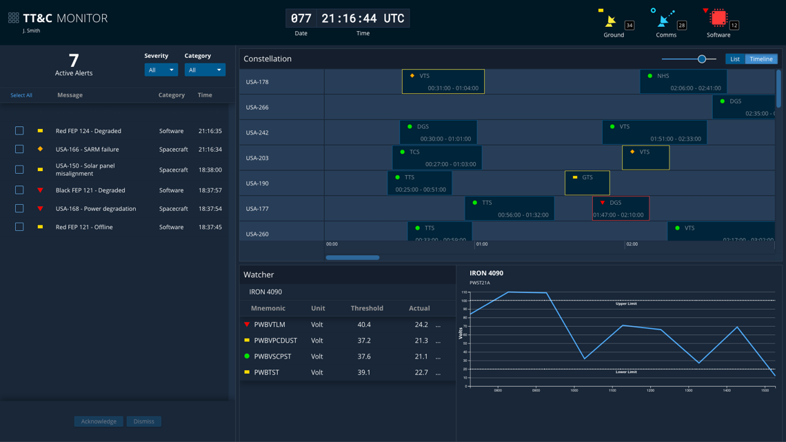
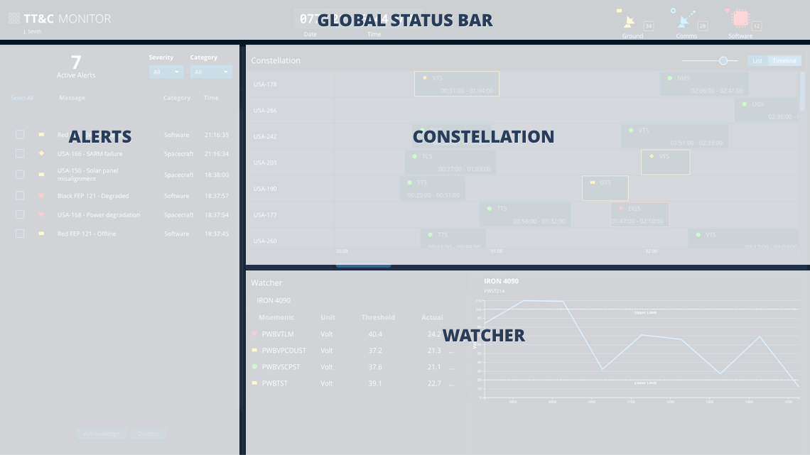
There are four main areas in the Monitor App: the Global Status Bar, Alerts panel, Constellation panel, and Watcher panel. The key elements are described below, but you can find much more design and task flow detail in the TT&C Design Specification and Wireframes documents. You can also launch the TT&C Monitor Sample App to explore the design interactively.
Global Status Bar #
As outlined on the About TT&C Designs page, each of the apps in the TT&C Suite is designed to occupy its own browser window, allowing operators to focus on the task at hand. But by virtue of being integrated into a suite, the apps share common functionality, such as a single login. Much of the shared functionality is provided in the Global Status Bar, an Astro component featured in all three apps. Though the status bar contents vary somewhat between apps in order to best support each app’s individual workflows, all contain a Clock, Monitoring Icons, and an App Switcher Menu that allows operators to transition quickly from one TT&C task flow to another.

- App Switcher Menu - The App Switcher Menu allows the user to launch new instances of different TT&C apps, sign in/sign out, and edit preferences.
- Global Clock - Time is central to many TT&C service task flows, so it is included in the Global Status Bar in all TT&C apps.
- Monitoring Icons - The Monitor App includes Upcoming Contacts Allocated (UCA) and Software status indicators, as well as status and alert counts for each of the top categories in the equipment hierarchy.
Alerts #
The Alerts panel provides operators with a roll-up of alerts across the ground system, satellite vehicles, and satellite subsystems. Operators can filter the alerts by Severity and Category, allowing them to quickly identify the most severe issues or focus in on particular areas of the global system. This allows operators to efficiently track their workflow and keeps the Alerts pane more sparsely populated, so they’ll be more likely to notice when new alerts come in. Operators can also drill in to see additional information on any of the alerts and launch an instance of the TT&C Investigate App to explore the issue further.
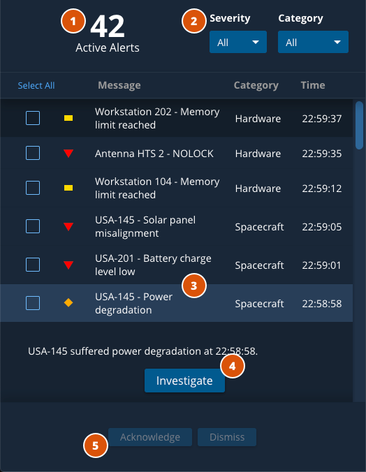
- Active Alert Hero Number - Shows number of active alerts at a glance.
- Filter Select menus - Filters alert list by severity and category.
- Expandable List Items - Expands to show alert details and call-to-action (if applicable).
- Investigate - Launches an instance of the TT&C Investigate App.
- Acknowledge/Dismiss - Acknowledges or dismisses alerts.
Constellation #
The Constellation panel shows the contacts for the satellites in the constellation. The operator has the option to either view these in a Timeline View, which shows past, current, and future contacts along a scalable time range, or in a List View, which provides additional detail on each pass. In both views, the user can click a contact to open a Modeless Pane containing its Contact Details or the associated Pass Plan.
Timeline View #
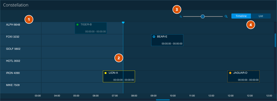
- Spacecraft Names & Status Symbols - Indicates spacecraft and current status and severity.
- Time Blocks - Shows contact/pass duration and respective ground station and ground station status. Clicking a time block also launches the Contact Details Slide-In Pane (Contact Details tab) where you can view contact details, as well as launch a Command Application Window for the corresponding spacecraft.
- Zoom Tool - Zooms in and out of the timeline, magnifying the time blocks and stretching the space between time increments.
- View Switch - Switches between List and Timeline views.
List View #
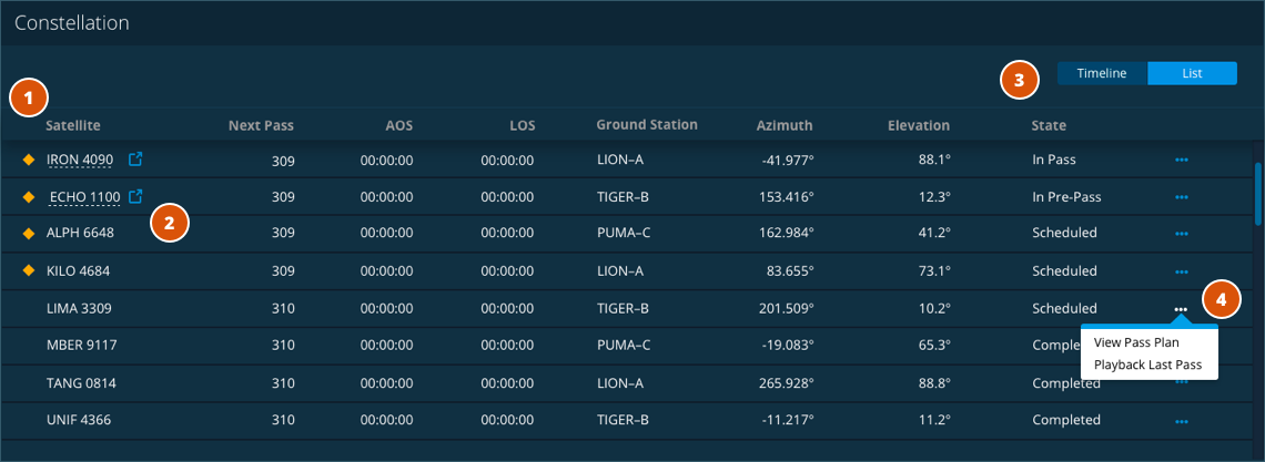
- Spacecraft Names & Status Symbols - Indicates spacecraft and current status and severity.
- Command Quick Launch - Launches the Command App/Window for respective spacecrafts (in active pass state). This interaction is indicated by the underline.
- View Switch - Switches between List and Timeline views.
- Actions Menu (View Pass Plan) - Opens the Contact Details Modeless Pane
Contact Details and Pass Plan Pane #
The Contact Details Modeless Pane opens on the right side of the browser window. It allows operators to view contact details for a spacecraft — including information such as next pass time, AOS/LOS, and state of contact as well as ground station details like name, azimuth, and elevation. Operators can also toggle the view to display the Pass Plan for the spacecraft’s current/upcoming pass, which includes details like AOS commands, steps, and run lengths.
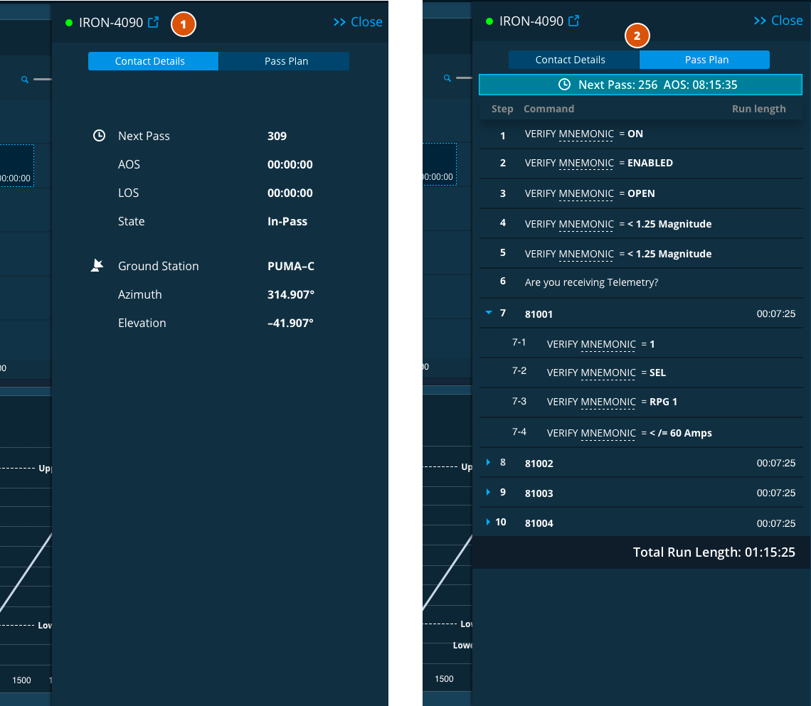
- Command Quick Launch - Launches TT&C Command App for the contact.
- View Switch - Switches between Contact Details and Pass Plan views.
Watcher #
The Watcher functionality allows the operator to flag and watch specific telemetry trends over time such as changes in battery levels and other mnemonic values. Mnemonics are monitored for actual value in relation to the assigned value threshold.

- Collapsible Item List - Items in the Watcher are categorized by spacecraft and can be collapsed or expanded to show the subsequent list of mnemonics being monitored.
- Mnemonics - Hovering over a mnemonic value shows the longhand version of its name. This interaction is indicated by the dashed underline. Clicking a mnemonic/watcher item changes the graph on the right to reflect how the values have trended over time.
- Editable Threshold Value - Threshold can be edited by clicking on the field, setting the desired value, and saving changes by clicking the checkmark icon.
- Action Menu - Allows operators to remove items from the watchlist and/or investigate them in the TT&C Investigate Application.
- Graph - Shows mnemonic value trends over time.
- Data Values - Hovering over a point in the trend line displays the associated value.
Task Flow Example - Prepare for Pass #
Below is an animated walkthrough of a representative task flow using the TT&C Monitor App. In this flow, an operator reviews the details and Pass Plan for an upcoming contact and then navigates to the Command App to conduct pass operations.
Design Materials and Source Code #
Below are design and development resources to get you started on an app that supports TT&C services. Note that there are some discrepancies between the design documents and the TT&C Monitor Sample App due to design improvements that were introduced late in the app development cycle.
| Resources | Description |
|---|---|
| TT&C Design Specifications (pdf) | The TT&C Design Specification contains information on use cases, task flows, UX research and wireframes for key features of the TT&C App Suite. |
| TT&C Design Wireframes (pdf) | The TT&C Design Wireframes document contains the complete set of wireframes (mid-fidelity renderings) of the screens designed for the TT&C App Suite. |
| App Source Code (Git Repository) | The source code Git repository and other useful documentation for the TT&C Monitor App is hosted at bitbucket.org so that you can check it out in detail. |

