Grid #
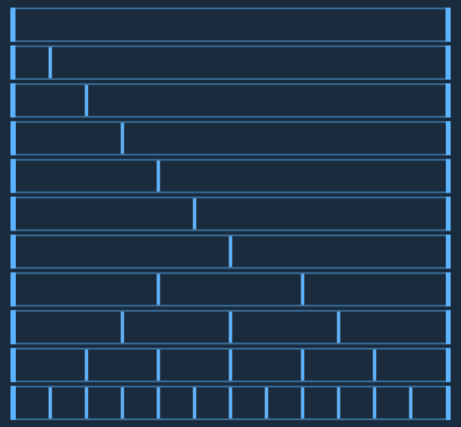
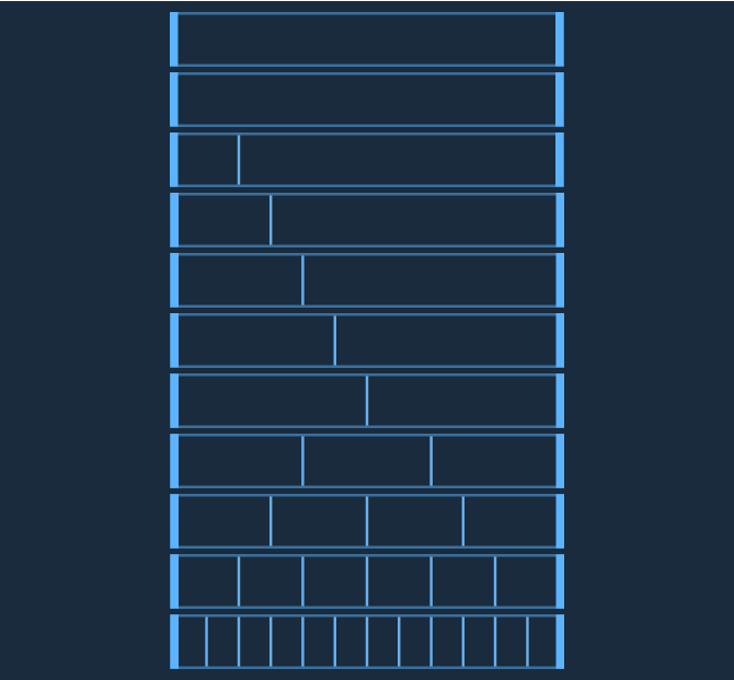
A grid system is a defined set of vertical columns and optionally horizontal rows based on time-tested principles of graphic design and layout. Ensuring a consistent grid system within your application and across all Astro applications creates a sense of continuity and relationship from screen to screen and app to app, even when the layouts between those screens may have dramatically different requirements.
Columns, Gutters and Margins #
The Astro Grid is a standard 12 column grid with column widths that expand or contract in relation to the width of the display. Columns are separated by a fixed-width gutter. Astro-compliant applications may use gutters of either 24 pixels (default) or 12 pixels (compact). The grid is enclosed by a fixed-width margin of 24 pixels. These specifications are for screen resolutions of 769px to 1920px max width.


Breakpoints #
At certain screen sizes, Astro optimizes for display on narrow devices by reducing the number of columns and rearranging the layout of your application via responsive design practices.
| Breakpoint | Columns | Margin | Gap | Gap (compact) |
|---|---|---|---|---|
| 0-360px | 4 | 16px | 16px | 8px |
| 361-768px | 8 | 24px | 24px | 12px |
| 769-1920px | 12 | 24px | 24px | 12px |
| 1921-3840px (large screens) |
12 | 48px | 48px | 24px |
4-px Grid #
A 4-px horizontal grid at 1920px resolution has been provided to help designers align layouts on a 4-px system with greater precision.
CSS Grid is the recommended method for implementing a grid in your Astro project. Using a custom layout grid adds overhead and layers of incompatibility, and as such, should only be used if your project requires backwards-compatibility with Internet Explorer 9 or earlier.
