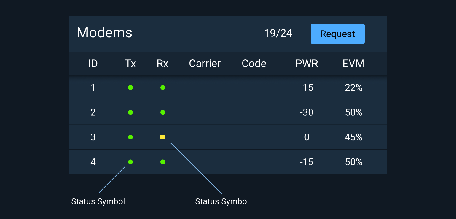
Status Symbol
The Status Symbol combines color and shape to create a standard and consistent way to indicate the status of a device or feature. When shown in Light theme, the Status Symbols include an additional inner border.

Rules of Thumb #
- Use the standard set of Status Symbols provided.
- Only use the provided colors for status.
- Use the highest color possible if multiple statuses are consolidated. For example, if the statuses of underlying components are green, yellow, and red, the consolidated indicator is red.
Adding a title attribute to status elements can improve accessibility by offering additional information about the status when the user hovers over the element or when used in conjunction with a screen reader.
Place your cursor over any Status Symbol above to see an example.
Related Pages #
- For a detailed description of how Status Symbols are used within Monitoring Icons, see Icons and Symbols.
- To learn more about the usage of status colors, see Status System.
Status Colors #
Status colors are provided for both light and dark theme versions of Astro in Hex, RGB, and CSS Custom Property values.
Dark Theme Status Colors #
| Hex | RGB | CSS | Synonyms | ||
|---|---|---|---|---|---|
 |
#ff3838 | 255,56,56 | --status-symbol-color-fill-critical-on-dark |
Critical, form error, alert, emergency, urgent | |
 |
#ffb302 | 255,179,2 | --status-symbol-color-fill-serious-on-dark |
Serious, error, warning, needs attention | |
 |
#fce83a | 252,232,58 | --status-symbol-color-fill-caution-on-dark |
Caution, unstable, unsatisfactory | |
 |
#56f000 | 86,240,0 | --status-symbol-color-fill-normal-on-dark |
Normal, on, ok, fine, go, satisfactory | |
 |
#2dccff | 45,204,255 | --status-symbol-color-fill-standby-on-dark |
Standby, available, enabled | |
 |
#a4abb6 | 158,167,173 | --status-symbol-color-fill-off-on-dark |
Off, unavailable, disabled |
Light Theme Status Colors #
| Hex | RGB | CSS | Synonyms | ||
|---|---|---|---|---|---|
 |
#ff2a04 | 255,42,4 | --status-symbol-color-fill-critical-on-light |
Critical, form error, alert, emergency, urgent | |
 |
#ffaf3d | 255,175,61 | --status-symbol-color-fill-serious-on-light |
Serious, error, warning, needs attention | |
 |
#fad800 | 250,216,0 | --status-symbol-color-fill-caution-on-light |
Caution, unstable, unsatisfactory | |
 |
#00e200 | 0,226,0 | --status-symbol-color-fill-normal-on-light |
Normal, on, ok, fine, go, satisfactory | |
 |
#2dccff | 45,204,255 | --status-symbol-color-fill-standby-on-light |
Standby, available, enabled | |
 |
#7b8089 | 123,128,137 | --status-symbol-color-fill-off-on-light |
Off, unavailable, disabled |
Light Theme Status Symbol Borders #
- In light theme Status Symbols should have a 1px border set to the inside of the symbol.
| Hex | RGB | CSS | Synonyms | ||
|---|---|---|---|---|---|
 |
#661102 | 102,17,2 | --status-symbol-color-border-critical |
Critical, alert, emergency, urgent | |
 |
#664618 | 102,70,24 | --status-symbol-color-border-serious |
Serious, error, warning, needs attention | |
 |
#645600 | 100,86,0 | --status-symbol-color-border-caution |
Caution, unstable, unsatisfactory | |
 |
#005a00 | 0,90,0 | --status-symbol-color-border-normal |
Normal, on, ok, fine, go, satisfactory | |
 |
#285766 | 40,87,102 | --status-symbol-color-border-standby |
Standby, available, enabled | |
 |
#3c3e42 | 60,62,66 | --status-symbol-color-border-off |
Off, unavailable, disabled |
